 The reviews last week really snapped me back into focus. I need to refocus my energies into being more productive; many hours of work do not necessarily result in a better product. I probably spent as much time researching and planning this project as I did executing it in Photoshop. I began with looking at eNewsletters from on-line, both templates and ones that I receive personally. I found that the over-all set-up is rather generic: logo/company name at top, title, and other company info. This was all encapsulated into a header of sorts. The items below varied from text to images but followed a rather pre-set standard. I wanted my design to have some traditional attributes (such as the top header) but to still deviate harshly and not seem like just another newsletter. This idea could blow up in my face when employers disregard it as junk mail. I’m hoping that companies that would compliment my personality would appreciate the non-formality.
I then stood at my drafting table, conte crayons in hand, and sketched out various layout concepts. As each one was completed I’d take it into another room and tape it to the wall. I did this so the new idea wasn’t influenced by the previous idea. I was then able to look at all the candidates, pick aspects I liked from each layout, and draw up a more rigid, well defined layout. I also mentally laid out what needed to be done when and how.
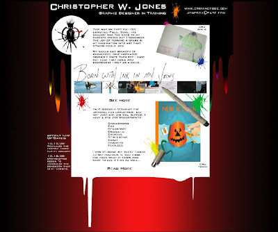
Still trying to focus, I choose the ink splats from my website as the page theme. The header is black ink flowing down and transitioning to colored tips (which echo the splats around the page). I came up with my title (and a few stand ins) with ink as the theme. The addition of the Micron pen was a last minute detail that adds to the theme and gives my title(s) a ‘just written’ look. My gallery pic bar is simply an aligned and cropped version of my gallery images. The inclusion of the drawing I did as a kid is to say “Yes I really have been creating since I was a little one. I’m not just saying I have to sound like an artist”. The New Yorker cover at bottom is a class piece that I’ve done in the past few weeks. I’m proud of how it turned out so I decided to showcase it.
In the Photoshop file I didn’t specify what objects would be links so here they are:
The Ink Splat logo (at top left; to home page), ‘See More’ (to gallery), ‘Read More’ (to artist statement), pic bar and The New Yorker cover (to gallery).
As I’ve said with all my pieces thus far, I’m happy with how this turned out. I actually think, in my opinion, that this is my best piece. It’s more my style (kind of goofy yet still serious).
Saturday, October 25, 2008
Project 7 - eNewsletter
 The reviews last week really snapped me back into focus. I need to refocus my energies into being more productive; many hours of work do not necessarily result in a better product. I probably spent as much time researching and planning this project as I did executing it in Photoshop. I began with looking at eNewsletters from on-line, both templates and ones that I receive personally. I found that the over-all set-up is rather generic: logo/company name at top, title, and other company info. This was all encapsulated into a header of sorts. The items below varied from text to images but followed a rather pre-set standard. I wanted my design to have some traditional attributes (such as the top header) but to still deviate harshly and not seem like just another newsletter. This idea could blow up in my face when employers disregard it as junk mail. I’m hoping that companies that would compliment my personality would appreciate the non-formality.
I then stood at my drafting table, conte crayons in hand, and sketched out various layout concepts. As each one was completed I’d take it into another room and tape it to the wall. I did this so the new idea wasn’t influenced by the previous idea. I was then able to look at all the candidates, pick aspects I liked from each layout, and draw up a more rigid, well defined layout. I also mentally laid out what needed to be done when and how.
Still trying to focus, I choose the ink splats from my website as the page theme. The header is black ink flowing down and transitioning to colored tips (which echo the splats around the page). I came up with my title (and a few stand ins) with ink as the theme. The addition of the Micron pen was a last minute detail that adds to the theme and gives my title(s) a ‘just written’ look. My gallery pic bar is simply an aligned and cropped version of my gallery images. The inclusion of the drawing I did as a kid is to say “Yes I really have been creating since I was a little one. I’m not just saying I have to sound like an artist”. The New Yorker cover at bottom is a class piece that I’ve done in the past few weeks. I’m proud of how it turned out so I decided to showcase it.
In the Photoshop file I didn’t specify what objects would be links so here they are:
The Ink Splat logo (at top left; to home page), ‘See More’ (to gallery), ‘Read More’ (to artist statement), pic bar and The New Yorker cover (to gallery).
As I’ve said with all my pieces thus far, I’m happy with how this turned out. I actually think, in my opinion, that this is my best piece. It’s more my style (kind of goofy yet still serious).
Subscribe to:
Post Comments (Atom)
No comments:
Post a Comment