Friday, October 31, 2008

Project 8 Sell sheet Redux

In this assignment, I approached re-working the sellsheet with the goal of creating something that would be part of my personal situation - Following the specs of the original assignment, but completely changing the context of the page.

I wanted to keep the color scheme of the original sellsheet, as it worked well for me and complimented the color in the art pieces feature in the new sellsheet. Utilizing the new logo I had designed for Ichthyography Ink, I put together an newsletter style “infosheet” called the Ichythograph … featuring a couple short informative articles, along with some visual draw from my illustrations, and a short sell paragraph, directing people to the business website for more information and eye candy.

I kept the page in a standard 2 column arrangement, but wanted to change the feel of the sheet, so loosened up the presentation with a couple of bleed images, some interesting text wraps, and a new logo, with the logo image unrestricted by its framing. I researched the content and rewrote the text entirely into two short articles, one explaining how natural science illustration is different from other art forms, and the needs it fills, and the other article with a brief definition and summary of a newer printmaking method called Gyotaku.

Wednesday, October 29, 2008

Project 6 - eNewsletter

The objective of this assignment was to create a informative e Newsletter that reflects our web page design from project 4. This assignment required us to come up with our own mission statement and to incorporate nine pieces of artwork that are included in our portfolio page in order to promote ourselves and our work. As in my website design, I wanted to work only in the viewable area of the screen so that my message could be communicated quickly and for the recipient to immediately get the overall feel of my email without having to scroll through the page. The major obstacle is this layout however is a limited area to arrange all of the elements of my design. The first step in creating this project was to do a good amount of research into practical examples of newsletters being used today with this format. Most examples I looked at tended to be scrolling pages and did not fit my criteria. I decided to use the overall feel of my website and kept the logo and top navigation where it is in my site. As for the body of my newsletter I chose a complimentary off white color and created a stamp like shape with elements of my design embossed into it. I chose this look to reflect a retro style type of mailing system with an antique feel. This also helped me choose the serif typeface, Georgia which I believed help to get my message across successfully. I enjoyed adapting my website design for this project and think that it is was beneficial assignment for our steps toward integrated marketing.

Sunday, October 26, 2008

Project7 emailNewsletter

The concept I have for this project was to present an email newsletter trying to maintain awareness of the limits of email browsers. I wanted to present some of my Illustrations to entice readers to visit my website, the ultimate goal of the email.

To avoid the appearance of being a direct webpage, I decided to combine a few of my illustrations into a single image which would show the detail of the individual works, yet illustrate the message of the email itself. Direct connections to the website are offered by 3 buttons, and a link on the name, Ichthyography, Ink . Websafe Verdana is use for text, and the other styles of Font are offered as images, generally part of a logo or a link.

The entire concept was kept to one “page” area with a live screen of 800 X 600 pixels, keeping both the text and tempts imagery available upon opening the email

Saturday, October 25, 2008

Project 7 - eNewsletter

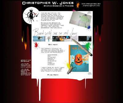
The reviews last week really snapped me back into focus. I need to refocus my energies into being more productive; many hours of work do not necessarily result in a better product. I probably spent as much time researching and planning this project as I did executing it in Photoshop. I began with looking at eNewsletters from on-line, both templates and ones that I receive personally. I found that the over-all set-up is rather generic: logo/company name at top, title, and other company info. This was all encapsulated into a header of sorts. The items below varied from text to images but followed a rather pre-set standard. I wanted my design to have some traditional attributes (such as the top header) but to still deviate harshly and not seem like just another newsletter. This idea could blow up in my face when employers disregard it as junk mail. I’m hoping that companies that would compliment my personality would appreciate the non-formality. I then stood at my drafting table, conte crayons in hand, and sketched out various layout concepts. As each one was completed I’d take it into another room and tape it to the wall. I did this so the new idea wasn’t influenced by the previous idea. I was then able to look at all the candidates, pick aspects I liked from each layout, and draw up a more rigid, well defined layout. I also mentally laid out what needed to be done when and how. Still trying to focus, I choose the ink splats from my website as the page theme. The header is black ink flowing down and transitioning to colored tips (which echo the splats around the page). I came up with my title (and a few stand ins) with ink as the theme. The addition of the Micron pen was a last minute detail that adds to the theme and gives my title(s) a ‘just written’ look. My gallery pic bar is simply an aligned and cropped version of my gallery images. The inclusion of the drawing I did as a kid is to say “Yes I really have been creating since I was a little one. I’m not just saying I have to sound like an artist”. The New Yorker cover at bottom is a class piece that I’ve done in the past few weeks. I’m proud of how it turned out so I decided to showcase it. In the Photoshop file I didn’t specify what objects would be links so here they are: The Ink Splat logo (at top left; to home page), ‘See More’ (to gallery), ‘Read More’ (to artist statement), pic bar and The New Yorker cover (to gallery). As I’ve said with all my pieces thus far, I’m happy with how this turned out. I actually think, in my opinion, that this is my best piece. It’s more my style (kind of goofy yet still serious).

Saturday, October 18, 2008

Project 5 newsletter

After reading through the text a few times, and searching the web for typical newsletters, I decided on a concept and approach to the project. The appearance of the newsletter, along with its logo would be based on one of the earliest newsletters known, a short news report in ancient Rome, known as “Daily Acts”, or Acta diuma. I wanted to express the feel of an ancient newsletter by using a brown/tan color scheme and a background (or represented paper type) of possibly, parchment.

I went with a background JPG I found called “old paper” which wasn’t parchment exactly, but gave the feel I was looking for, while representing a course paper rather than an animal skin parchment.

The photos were chosen to illustrate the text of the newsletter, and sized and worked in photoshop. The text illustrations were made into duotone, but the newsletter logo header and a single background image, use for the character of the newsletter itself, not the article presented, worked better in CMYK, while keeping with the color scheme of the piece. The logo was constructed in Illustrator. All other work was done in Indesign. Right from the first read, it seemed to me that a table would be the best approach to present the comparative information in the article.

Project 4 Web page

Revising the first webpage design, I chose to create a new studio logo in Photoshop, focusing on one of my recent illustrations using a subtle lighter colored palette for the page. Link Buttons were made from close-ups of eyes of several of my pieces, illustrating the Slogan, “eye for excellence”

The portfolio page features the original thumbnails of my illustrations as link buttons, a smaller version of the logo, and the same subtler page colors as the revised web page.

The top navigation bar includes Home, Portfolio, About the Artist, and Contact.

Thursday, October 16, 2008

Project 5 Newsletter

Project 2 Logo

The goal of the project was to take two words that summed up your essence as a person. The two words that summed up my essence were outgoing and outdoorsy. Using these two words my goal was to have my logo feel earthy yet lively. I started with just using the first letter of my last name and turned it into an initial cap. I turned my “H” into a tree. The tree represents the outdoorsy side but also represents the outgoing side. The tree represents the outgoing side because the roots are spread out and reaching throughout the logo design. I used the green background for the earthy feeling. I also added the black edgy outline of the background to give a more outdoorsy feeling as if the tree is sitting in dirt and or on the ground. My goal for the business card was to keep it clean and simple because the logo itself dominates the design so if there was more involved I believe it would be too much.

Project 1 Poster

The reason for the poster project was to show Frank Lagar's "essence" and what makes him who he is. Frank Lagar is very artistic especially when it comes to fine arts. He has a goal to become an ideal figure drawing artist that he can be. I made the steps with an arrow which is written in spanish first.  They are in spanish because what a lot of people don't know or don't realize is that Frank's nationality is 100% Cuban. The steps are a symbol of what Frank already has and what his goals are. He has a family, a wife, cats, a house, a career. He told me he was on a journey to pursue his career so the words career and visual are at the top because that is what he is working towards. When it comes to his career he wants to have a stronger visual sense of creativity while already having a strong audio sense. That would explain why he is in school so he can pursue his career in Graphic Design. The second part to this project that I came up with was the hand drawing. I decided on the hand because again Frank's main goal in life is to become the best artist he can be. He likes to draw and wants his drawing ability to be stronger. His favorite style of drawing is figure drawing with graphite pencil. So I drew the hand with the pencil which is at the top of the steps because that is his biggest goal.  The colors choices express Frank's personality. I used the gradient to show two different sides to the colors. The bright part of the orange and yellow express Frank's good sense of humor while the light colors express that he is an easy going, relaxed person. 

Project 4 Website

The purpose of this project was to design your own website based off a work of art of your own. The website was to not only show the artwork but use it to bring out your essence as a person. I used a piece of my artwork that is an acrylic painting. This acrylic painting shows how I brought my fine art skills into my design skills. The colors of this artwork also have a meaning. The monochromatic colors of the green give off a cool appearance. Cool colors tend to have a calming effect and I wanted to use the monochromatic colors of the green to have that effect in my website. The design of the artwork is a doodle or sketch that I drew myself in a notebook, loved it and brought it into a painting. I feel that the logo I made and the artwork have a resemblance with each other. The abstract tree in the artwork and the tree in the logo give the natural feeling along with the color tone. This was another reason for using this piece of artwork. I wanted my website to have a simple and clean feeling yet fun and interesting. I wanted the cool colors to sit with the black to give a feeling of balance and draw your eye more to the monochromatic tones. The second part of the website was for my portfolio. It was based off other work that I have done. At first I tried to change the tones of the artwork behind the abstract tree and it felt too much. I then decided although the orange and yellow became very dominant in the page it was strong. The dominant color of the orange and yellow didn't take away from the monochromatic colors but formed as an accent color gave the page a meaning.

Asignment #5 Newsletter

My overall goal for this newsletter was to create something that was open and inviting to the audience. I accomplished this in two main ways: color and graphics. I chose gourmet mustard yellow (PMS 3985c), which I felt was a progressive color. Also when married to the white of the page it furthers opens the pages up. Throughout the copy, I reference this color in varying percentages. One key element is the use of colored text in the background. Appropriate words were chosen based on their relevance to the copy. The idea here being that these background words reinforced the main subject(s) of the article. In addition, the copy is bracketed in a large colorful “L-shape” that is repeated on each page. This shape serves to isolate the copy in the corner of the sheet. My chosen color really orkes in my favor here by emphasizing the copy while not making it feel constrained. As for graphics, I created a simple vector illustration for the masthead. The idea behind that was part Rene Magritte (surreal men in bowler hats) and the nostalgia of the printed newspaper. The bowler character was about charm and whimsy. Ultimately, he gives the piece a bit flair and considering his prominence on the cover I thought the reader would welcome his presence. The fact that he is holding a newspaper is also a fun reminder of where we have been. The title as a graphic is also meant to be modern and slightly techy. I achieved this by using a much smaller font size for the “5” and by dropping it relative to the main text. The title ends up feeling more like something off the periodic table. I found some natural breaks in the copy and created a pull quote as well two charts. Once again, color and graphics were used to accentuate the data in a fun and readable manner.

Assignment #3 Sales Sheet

Our stated goal with this assignment was to create a sales-sheet for a fictitious newsletter marketer (E-Marketer Factoid and the B-Team Lunch). Research was my key to understanding how to best construct a sheet that evoked my copy’s theme (College Kids Lead the Way Online). I needed to create a contemporary and young look while not losing any of the topic’s impact. For me, the header was the real estate where I needed to grab the readers’ attention and pre-sell them on what they are about to read. I decided to create my own unique version of the ipod advertisements. My header features the silhouettes of young college students (in three colors: black, orange and white). Due to the popularity of Apple’s campaign, I felt this would visually clue the reader into the subject of the sheet. I also created a series of horizontal color bars (colored in a % of the main PMS color) as a counter balance to the silhouettes. They also act as visual flourish that portray the notion of college kids leading the way. I repeated this theme at the bottom of the page (on the opposite side). My copy is nestled into a three-column set up on the white paper background. The negative space of the page allows the copy to breathe freely. I isolated the pull quote in the center of the page and highlighted in the main color. Finally, I used a colorful data chart and a demographically appropriate image to punch up the copy and end the sales sheet.

Assignment #2 Logo

The goal of this assignment was to create a unique brand identity to be used as my logo. The process portion of this exercise included independent research on the web and various design trade pubs (including Communication Arts and HOW Magazine). My first goal was to see what was out there and what I liked and didn’t like. Almost instantly, I felt that a text-based logo was the direction that I needed to head in, if not simply because text is a self perceived weakness of mine. In my first assignment I delivered a strong vector illustration and with this new task I needed to test boundaries and knock myself out of my own comfort zone. Beyond my research, the only other concrete piece of information I had were two teacher provided words that were to serve as the basis for our personal logo. My two words were: inspired and direction. Inspiration, for me, invoked a sense of journey and challenge that fit nicely with the theme of “direction”. Since I know myself better than anyone, I felt that a simple yet slightly elegant font was in order. Also, my heritage includes the influences of Spain and Cuba, which meant I needed to imply some type of ethnicity or old world flavor. I chose Ayuthaya, which is a thicker san-serif font. I felt it gave my name a blocky and graphic appeal making it not so much a persons name but an object (or in this case a brand). Finally, I needed a visual solution to create the illusion of “inspiration” and “direction”. The result was the repetition of my name creating a wave of text that lurches upward creating motion and forcing your eyes to move. From this wave of letters, which at some point blacken the space, arises a final clean version of my name.

Project 5 Newssheet

When I began thinking about how I was going to create the newsletter this week, I decided to go in a totally different direction than I normally would have. As a designer, I am always trying to push myself a little bit further; get out of my comfort zone. So I began looking at all sorts of references, but this time I looked only at things that made me feel a little bit uncomfortable. The newsletters I looked at were bold and different and definitely didn’t always stay locked into a grid. That’s where my inspiration began. After finding materials that appealed to my tastes but not necessarily my style, I started to put together the newsletter. Instead of staying strictly to the style I thought would work for “the client” I looked at the copy in shapes and blocks. This helped me to put the design first and the article second. While this isn’t a great habit to get into all the time, I think it was a good exercise for me this week. The final piece has certainly evolved into its own creation. I pushed my design capabilities a bit further this week, and in the process I made myself a little bit uncomfortable. But when has being comfortable brought about terrific art? While this may not be one of my best pieces of design, it certainly is different.

Project 4 Website

This weeks project was a fun one to create. We had to design a two page website that featured a piece of artwork as well as an artist's statement and portfolio. Normally I am not a fan of doing web design, but we weren't required to build the page at this time. All we had to do was create the layout in Photoshop. This was excellent news for this Dreamweaver detesting designer.
The first thing I did for this project was to go and research some really cool websites. The one I found that was my favorite was the site for Mohawk Fine Papers. This is the site I modeled my design after. After looking at all the other neat websites I found, I felt my creative juices start to flow and fast and easier than I had expected.
Overall, I am very happy with the final piece for this assignment. n the future, when I have successfully mastered Dreamweaver, I hope to put this design to good use.

Project 3 Info Sheet

Doing an info sheet was definitely a creative challenge this week. Having so much information to have to fir into a well designed page was not an easy process. To add onto that, I just couldn't seem to find that "umph" feeling until the very end of the process. This project was more of a "real world" experience for me because it forced me to design something I didn't enjoy. Having to take information that was in no way interesting to me and having to work when I wasn't "in the mood" so to speak was a challenge.
However, all these obstacles considered, I believe that my piece is successful. The elements are all cohesive and appealing to the eye while conveying all the necessary information.

Assignment #4 Web

The goal of this project was to create an Internet portfolio web page design incorporating our own logo (from assignment #2) and previous class work. There were two main parameters given to us: #1- the main page must highlight our work from the poster assignment #2- the portfolio page design must not only accommodate one our previous assignment, but must be designed to display future pieces in a logical manner. The idea is that this design would grow with the artist body of work. My personal logo is a text-based design that takes multiple text applications of my name and creates a wave formation lurching into the upper left hand corner of the logo. Rising from the top of that wave is one clean application of my name. The challenge here involved creating a design that mimicked or mirrored my logo. My solution involved creating a grid of various sized rectangles. These rectangles are organized in an almost like stained glass fashion with little attention to gaps or uniform sizes. It’s as if the web page was crafted in glass and dropped on the floor and then pieced together again. I felt this concept mirrored my logos usage of text in a frenetic manner. Using Photoshop I pasted in my poster assignment piece underneath the grid. At that point, I made a design decision to not completely expose the poster but rather selectively reveal small portions of the design. The result is a mosaic index page that mirrors my logo in color and creative attitude. My portfolio continued the usage of black tiles. However, the live area is unknowingly divided into two halves. The left portion of the page contains the logo and a larger thumbnail display of the selected artwork (in this case my koi poster). The right half of the page contains more black tiles each with a small thumbnail linked to a portfolio piece. Users would select a thumbnail from the right and the left page would refresh and display an expanded version of the artwork. Users could then have the option of selecting the piece and viewing an even larger version of the design. As users click on thumbnails, a new artist statement would also appear on the left hand side. The idea behind the design is that page would grow vertically on the right hand side as more and more thumbnails are added.

Project 2 Business Card

In creating this logo to describe the "gut feeling" that describes who I am, I needed to first figure out the words that would describe who I am. When I was thinking about this, I came up with a lot of different words that were some kind of a paradox; this is because there is a lot that's changing in my life right now.
The words that kept coming to the front of my mind were complex and chaotic. It was what my gut kept telling me, so for once I decided to listen (seeing as that was the assignment anyway...). Being an overthinker, this is something that has been taking some getting used to. So knowing that things are changing for me in general, I decided to continue with this new thinking process. I started sketching without thinking and without a clear idea of where I wanted to go. It took a little while, but I finally came up with a logo that I think gives the viewer a little bit of insight to where I am right now.

Project 1 Poster

When I began thinking about creating a poster to represent Joanna, I couldn’t get the idea of coming home out of my head. When I conducted the interview, the most important thing that she talked about was her family and the time they spent together. When we had conversations during this past week there was usually something thrown in there about her family somewhere; whether it be about how her dad helped her out or how she had to borrow her sister’s car, they were always there. Another thing that is a big part of Joanna’s life is being outdoors. When I asked her to tell me about one of her favorite experiences, she told me about one of the many hikes she’s taken. Being active and experiencing nature are two other big parts of her life. Not everything about Joanna was bright and cherry, however. She has had some life-changing revelations and experiences. Although it has taken her some time to get where she wants to be in life, she is there. She’s has reached the peak, so to speak. In this poster I wanted to represent a part of her journey through life and the things that seem most important to Joanna. By creating imagery of a plateau and a tree, her love of nature and exploration is shown. The word home is the foundation of the piece, as it is a foundation for her life. The poster shows the finish of a long, uphill journey, and the magnificent view from the top.

Assignment Five Newsletter

This is the solution I came up with for the newsletter. The body copy is all about different methods of doing things. So I wanted to express this concept within the designs. On one side of the newsletter the majority of it is a very edgy and modern design whereas the other side is mostly classy. The main point of this piece was to integrate two polar opposite designs with each other.

Assignment Four Website

I designed my website around the concept of simplicity. I am a very simple guy so I thought a website based around my work should personify that. I wanted to keep the design sleek and clean looking. By using a color palette of only pastels and black and white, it gives the piece an elegance while giving off a sense of edginess with the font I used called "atmosphere". 

Assignment #1 Poster

The goal of this project was to capture the essence of Stephen DiCerbo. To that end, I began my creative process by interviewing Stephen and using his answers to sketch out a broad concept. I quickly realized that my big challenge would be to create a visually efficient design that reflected Stephen. I fused Stephen’s answer into one or two manageable concepts that revolve around the one central theme of transition. In this case it is Stephen’s transition from a full time job in engineering to the role of an artist (a full time natural science illustrator). The piece depicts a brocaded koi fish jumping from an ordinary goldfish bowl. The koi fish symbolizes Stephen. In Asian cultures the koi fish is seen as not only a symbol of luck, but of perseverance and success in life due to its natural grace and beauty. Koi are typically depicted swimming upstream against the current, which demonstrates their perseverance. These fish also reflect a certain amount of grace, detail and beauty, which nicely mirrors Stephen’s ability as a natural science artist. The koi is also the frequent subject of Japanese prints . Stephen teaches Japanese print making in his spare time. I tinted the fish with a red hue, which is my subject’s favorite color. Red is also seen a passion and love color, which also plays nicely to Stephen’s passion for art and his drive to change careers. The goldfish bowl acts as the world that must be overcome so that Stephen’s transformation into an artist can occur. Simply put, the bowl is the mundane world occupied by cookie cutter, inartistic fish. Their world is surrounded by grey bland water while Stephen’s new world is flooded with color and light.

project 5 Newsletter

Paul Ignizio

News Letter Project

I feel like I really had inspiration on the first page of this project but the connecting elements fell short after that.  I’m not disappointed with it I just believe that it will need to be reworked into a more refined piece before it makes its way into my portfolio. 

Just got really into that first page, I believe that my layout is good it is just lacking in connectivity between the first main page and the subsequent content pages.

Project 4 Website

Web Site

Paul Ignizio

This project was something that I had done several times before.  The guide that we had to do was new but it helps to organize thoughts.  I enjoyed this assignment, mostly because of the simplicity of it.

The color scheme of blues and whites I felt helped make the few blacks stand out better.  Making the logo “pop”. The scroll over’s are supposed to open up sub menus on the side of the Nav bar with out interfering with the text or image displayed in the main part of the site. 

Project 3 Infosheet

Info Sheet

Paul Ignizio

This was a challenging project because there were so many possibilities to fulfill the criteria of the project.  I decided on the simplistic style because it is clean and direct, but it has a good central focus.  Unfortunately the central focus divides the layout and creates and imbalance. 

This is yet another work that must be redone before it finds its way into my portfolio.  Heck I think its going to have to be a complete overhaul. 

Project 2 Logo

Paul Ignizio

Logo/Business Card

This logo was made entirely in illustrator.  I had to create an image that showed the complexity of my personality as well as my personal desire to protect.  Protect was easy as I prefer to use the normal symbol for it which is the shield.  The shield is decorated with a wing like coat of arms with my last names initial as the focus.

The symbol is meant to be black in white, as it gives it a more simplistic but clean feel to it.  The name underneath it was picked as I needed a title for my “place of business”.  I chose the name based off of what my friends claim is my twisted mind.  Please not that the Logo with title is from the business card design.

Project 1 Poster

“Essence of Chris”

By Paul Ignizio


This poster was made to show the essence of Christopher Jones.  I’ve been in classes with Chris previous to this one which assisted on the making of this piece.  Chris has always struck me as a talented individual with creative ideas, and a determination to see those ideas fully manifested, whether they be on paper, a computer screen, or a three dimensional sculpture.


His creative mind is seen in this piece as the light bulb, its glow lighting his way through life.  The colors within represent various thoughts and ideas that are not focused.  They are the thoughts that are not high priority, where as the “spark” in the middle is his focused thought his main priority.  The dark shape is that of a shark, this represents his determination.  This is because a good idea is to an artist as the scent of blood is to a shark, irresistible.  The main thought or “spark” inside the shark shows that he is determined to finish what he has started.

Wednesday, October 15, 2008

project 4 web page

For my website design I began by researching other artist’s websites and portfolio pages.  I looked at the layout as well as use of colors and design aspects.  My immediate approach was choosing the artwork I wanted to display on my home page.  Some of my favorite works consists of close up drawings of body parts and facial features.  Once I brought them into Photoshop I chose a monotone color for each piece making sure you could still tell that they were done simply in pencil.  I then brought in chunky black shapes to weigh down the background and placed an image behind that.  The image I chose is a picture I took of my friend’s band.  Although this has nothing to do with my artwork I used it because it’s cropped to show body parts in motion.  I also made this image monotone to match the rest.  For my portfolio page I used the same layout and color palette.  This page features more of my work as icons that you can scroll through.         

Monday, October 13, 2008

Assignment 5 : 4-page Newsletter

I decided to take a different approach with this project, as compared to the four previous ones. Prior to doing any form of research or reading the articles, I sat down with a #2 pencil and vomited forth some generic page layouts. I didn’t want to have a single idea being dominant and narrowing my vision; I wanted a squeaky clean slate at the outset. I produced a page full (about 20 layouts) and then sat down with the articles. While I was reading I jotted down keywords in the margin that were used to do images searches. I grabbed various images that I thought jived with the theme of the articles and made a master Photoshop file. In my search I also found a header/masthead example that I thought looked super sexy. Now that I knew the punch of the articles and had an idea of what images I would be using, I went back to my sketchpad and selected which roughs could work. I then moved into InDesign. I’m beginning to feel rather adept at this new (for me) program. I created 4 (5?) different paragraph styles that kept evolving yet stream lined my work. I did the rough layout with text frames and then copy-and-pasted all the text in from Word. I’d say that I actually had more time this project (as compared to the single-page newsletter) to be more nit-picky about the details such as leading, kerning, widows etc. I was also having a lot more fun with this project; not as much trail and error as the first time through. I feel like I learned quite a bit through this experience. I learned how to make Clipping Paths in Photoshop and import them into InDesign. I used text wraps for both images and pull quotes. I also discovered the importance of using layers in InDesign. I was having issues with stacks of images and text and then not being able to select what I wanted. I finally broke the piece up into background, image, and text layers so I could lock one while messing around with another. I’m comfortable with my final submission. I would like more time to finesse it a bit more (I think that there is too much space on some pages) and also work on my “Version 2.0”.