 This poster was created for a movie based off of a game. Gears of war was a sci-fi shooter genre and was known for its high pace of action and need brutal "AI". The poster is to show that it is a movie about war but a war with the unkown. I believe that this poster accomplishes this nicely. To credit the development teams for creating this game I've used their names for the bottom of the poster.
Showing posts with label Paul Ignizio. Show all posts
Showing posts with label Paul Ignizio. Show all posts
Thursday, December 11, 2008
Project 10 Movie poster
This poster was created for a movie based off of a game. Gears of war was a sci-fi shooter genre and was known for its high pace of action and need brutal "AI". The poster is to show that it is a movie about war but a war with the unkown. I believe that this poster accomplishes this nicely. To credit the development teams for creating this game I've used their names for the bottom of the poster.

Project 9 flyer
 A flyer design made to raise awareness about adults with Alzheimer' s who wonder off. I attempted to make the it deep and serious with a silhouette was an elderly person walking away. It is a good idea that I will refine later for a stronger portfolio piece.
Project 8 T-Shirt Design

T Shirt Design
This design was fun because it was on what I wanted to do, and I got to do it in illustrator. I went with a raven on a shield with a spear, which are symbols from Norse Mythology that are associated with Odin. I have since revamped the design to no longer include the shield but a more tribal red background to allow for the extremes of White and Black to make the image more powerful.
Project 7 Info Sheet Redux

 Redone info sheet
This project was a chance to remake one of the least successful pieces. I chose to remake the info sheet from project 3. Though I do believe that this one over all is better I still feel as tough it is lacking in some way. It is a piece I’m afraid that will have to be reworked again before it finds itself in my portfolio.
Project 6 E-Newsletter
 This project was a throw back to the website design. I felt that by mimicking the basic layout I would get a more connected feel. I belie e that the new color palette of warm earthy tones has a better feel to it then the original websites blue.
Thursday, October 16, 2008
project 5 Newsletter


Paul Ignizio
News Letter Project
I feel like I really had inspiration on the first page of this project but the connecting elements fell short after that. I’m not disappointed with it I just believe that it will need to be reworked into a more refined piece before it makes its way into my portfolio.
Just got really into that first page, I believe that my layout is good it is just lacking in connectivity between the first main page and the subsequent content pages.
Project 4 Website


Web Site
Paul Ignizio
This project was something that I had done several times before. The guide that we had to do was new but it helps to organize thoughts. I enjoyed this assignment, mostly because of the simplicity of it.
The color scheme of blues and whites I felt helped make the few blacks stand out better. Making the logo “pop”. The scroll over’s are supposed to open up sub menus on the side of the Nav bar with out interfering with the text or image displayed in the main part of the site.
Project 3 Infosheet

Info Sheet
Paul Ignizio
This was a challenging project because there were so many possibilities to fulfill the criteria of the project. I decided on the simplistic style because it is clean and direct, but it has a good central focus. Unfortunately the central focus divides the layout and creates and imbalance.
This is yet another work that must be redone before it finds its way into my portfolio. Heck I think its going to have to be a complete overhaul.
Project 2 Logo

Paul Ignizio
Logo/Business Card
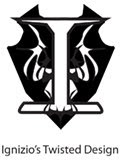
This logo was made entirely in illustrator. I had to create an image that showed the complexity of my personality as well as my personal desire to protect. Protect was easy as I prefer to use the normal symbol for it which is the shield. The shield is decorated with a wing like coat of arms with my last names initial as the focus.
The symbol is meant to be black in white, as it gives it a more simplistic but clean feel to it. The name underneath it was picked as I needed a title for my “place of business”. I chose the name based off of what my friends claim is my twisted mind. Please not that the Logo with title is from the business card design.
Project 1 Poster

“Essence of Chris”
By Paul Ignizio
This poster was made to show the essence of Christopher Jones. I’ve been in classes with Chris previous to this one which assisted on the making of this piece. Chris has always struck me as a talented individual with creative ideas, and a determination to see those ideas fully manifested, whether they be on paper, a computer screen, or a three dimensional sculpture.
His creative mind is seen in this piece as the light bulb, its glow lighting his way through life. The colors within represent various thoughts and ideas that are not focused. They are the thoughts that are not high priority, where as the “spark” in the middle is his focused thought his main priority. The dark shape is that of a shark, this represents his determination. This is because a good idea is to an artist as the scent of blood is to a shark, irresistible. The main thought or “spark” inside the shark shows that he is determined to finish what he has started.
Subscribe to:
Posts (Atom)