Thursday, December 18, 2008

Diane Arbus Layout

For my project I was asked to create a magazine layout for an important person. I decided to choose Diane Arbus because she is one of my favorite artists. For the layout, I wanted it to be like a “coffee top book” layout style. To achieve this effect I made sure there was a lot of white space and a serif font. The photos were also in black and white which helped. There are some minor tweaks to make, but overall I am, pretty satisfied since this was on of my first multiple page layouts.

Tuesday, December 16, 2008

Project 11 - Ultimate Portfolio Piece

The final assignment for Digital Production. This semester has flown by at break neck speeds; where’d the time go? Anyway: I want to give a quick over-view of why my project is what it is. A few years back I worked in a board game store and this is where I was introduced to the Killer Bunnies card game. I taught my family how to play, any friends that didn’t know how, and everyone in between. So many Friday nights were spent at my apartment, 13 people crammed around my kitchen table, the majority of us highly intoxicated, playing this silly little game until 3-4 in the morning. No one cared who won at the end of the night; it was just being with each other enjoying life. I’ve also met some really great people, whether here in Albany, in Columbus, Ohio, or out in California, due to this game. I’d love to hold an event to bring all the friends and acquaintances together to have a huge KB night; just have a great time. This is the basis for my project. First a postcard would go out to let all the followers know that we are up to something. The bunny in Albany grew from a suggestion from Mark; I thought, visually, it’d be exciting/interesting to have the hint of a bunny on the front with the full fledged rabbit on the back somewhere in Albany. I attempted to keep the artistic styling of the bunnies from the game by using Illustrator to bring them to life. The background images were found on-line; it’s to cold to take pictures outside. The second wave would be an eNewletter again letting folks know, more specifically, what we are up to and that our website is up and running again. The buttons on the side of the page would link to various parts of the website. The third piece, the poster, would be hanging at the event location both prior and during the event. If this event were to come to fruition I’d change the text of the poster to be more specific for the actual event. Finally, since I’ve invested so much money in the game and this event, I’d unvail the first official Team Albany KB t-shirt for sale at a reasonable price. While this project kept me awake for nearly a week straight, I had fun putting it together. I tried to swipe aspects of the actual game cards and use them in my design. The text boxes and web link buttons are derived from the cards. The violet circle in the upper-left of the postcards signifies a “Very Special” card in the game; I wanted to include little tidbits for the KB fan. After all, they are what this event would be all about.

Project 11 - Portfolio Piece

For our last assignment of the semester we were given the opportunity to chose a project that would best suit our portfolio. Though I was very interested in doing something fun and illustrative, I was given the opportunity to work on the identity of a local non-for profit agency, the New York Council on Problem Gambling. For this assignment I was required to come up with a new logo and tagline and implement them into an advertisement. As I began working with the company I soon realized that I was going to be very limited as to what I could do to manipulate the logo that they are now using. The client was very adamant on keeping the same color scheme as well as the New York State icon as part of the new design. The same holds true for their tagline, ‘Hope for you and yours” – it was something that they did not want to change. However, they were looking to implement their acronym into the design and this is where I concentrated my approach. The original logo is comprised of a dominant image of the state of New York with text laid casually over it. In my design I wanted to focus on creating an iconic logo that utilized the agency’s acronym as the dominant force and reduce the size of the state to make it a secondary element. I also wanted to focus on creating a logo that communicates a feeling of strength and stability, which I believe are important aspects of this organization in providing help for others. Over the course of the next few weeks I hope to be able to implement this design into other parts of their identity such as new stationary and media templates. If all goes as plans, this project could yield a great, practical piece to my portfolio.

Monday, December 15, 2008

Project 10 Missing Poster

For this week's assignment we had to design a poster that advocates missing people.  First, I decided I wanted to design a poster for elderly people who have Alzheimer's disease.  I looked up many statistics about Alzheimer's and came across one that I thought was the most affective.  I then brought in an appropriate picture to add emotion.    

Project 9 T shirt

I began my Tshirt design project by researching many different shirts.  After that I decided that I wanted my design to flow with the shape of the body.  To go about this I created a tree-like face using clippings of some of my vine drawings.  I chose to use a plain white t-shirt with green and brown vines.

Project 7 eNewsletter

For my eNewsletter I designed a simple layout which includes a brief description about myself and some contact information.  At the bottom of the email I featured a small collage of some of my drawings as well.  Overall I wanted a clean straight to the point email newsletter.  

Final Project - Promo Cards

My final project was to design a couple of promotional mail-out cards to be used to advertise the benefits of my natural science illustrations. I attempted to showcase the illustrations, in addition to pointing out the strongest attributes of the work and its benefit to the customer. I wanted to keep the design clean and simple, and striking to the eye.

Sunday, December 14, 2008

Project 5 Newsletter

After researching many different newsletter designs I finally decided to go with a geometric layout.  I brought in some square shapes to keep it playful and simple.  I wanted to keep my design clean and easy to read.

Thursday, December 11, 2008

Project 10 Movie poster

This poster was created for a movie based off of a game. Gears of war was a sci-fi shooter genre and was known for its high pace of action and need brutal "AI". The poster is to show that it is a movie about war but a war with the unkown. I believe that this poster accomplishes this nicely. To credit the development teams for creating this game I've used their names for the bottom of the poster.

Project 9 flyer

A flyer design made to raise awareness about adults with Alzheimer' s who wonder off. I attempted to make the it deep and serious with a silhouette was an elderly person walking away. It is a good idea that I will refine later for a stronger portfolio piece.

Project 8 T-Shirt Design

T Shirt Design

This design was fun because it was on what I wanted to do, and I got to do it in illustrator. I went with a raven on a shield with a spear, which are symbols from Norse Mythology that are associated with Odin. I have since revamped the design to no longer include the shield but a more tribal red background to allow for the extremes of White and Black to make the image more powerful.

Project 7 Info Sheet Redux

Redone info sheet This project was a chance to remake one of the least successful pieces. I chose to remake the info sheet from project 3. Though I do believe that this one over all is better I still feel as tough it is lacking in some way. It is a piece I’m afraid that will have to be reworked again before it finds itself in my portfolio.

Project 6 E-Newsletter

This project was a throw back to the website design. I felt that by mimicking the basic layout I would get a more connected feel. I belie e that the new color palette of warm earthy tones has a better feel to it then the original websites blue.

Project 10 - Missing Persons Advocacy

Our assignment for this week was to produce a four color advertisement for Missing Persons Advocacy. We were given a choice of national organizations to choose from and were asked to create an emotional design that promotes awareness of this problem. After researching the various organizations websites I chose to focus my attention with the Alzheimer’s Association and the epidemic of wandering. This problem occurs when a person suffering from the symptoms of Alzheimer’s and dementia become disorientated or lost in their normal surroundings and is ultimately at risk of surviving in unsafe elements if not found. I remember reading about such a case in my local newspaper recently and decided that it would be a good topic to raise awareness about. In developing my design for this assignment I wanted to focus on creating something that was very stimulating and shocking in order to really communicate the seriousness of this problem. I initially tried to accomplish this through imagery – but after many hours of trying to source the perfect photo to no avail, I turned my attention towards the headline as the point of emphasis in my piece. The shocking title is intended to make the viewer react and want to look deeper into the advertisement’s copy to fully understand what is going on. As for the image, I chose to work with simple, everyday element of an elderly person taking a walk. The choice of this image doesn’t give away any the meaning of the piece and is intended to make the viewer wonder how it relates to the shocking title. Obviously something terrible has happened, but you don’t know exactly what until you read further into and find out that he has become a victim of this epidemic. In this way I believe I created an intriguing piece that communicates a problem that needs to be addressed and the emotional manner in which it is presented hopefully adds to the necessity of it’s awareness.

Sunday, December 7, 2008

Wednesday, November 26, 2008

Project 10 - Missing Persons Advocacy

(Now with redone logo) Last week, my submission was pretty much critiqued into oblivion. I completely agree with everything that was said about the piece not having a unified visual theme. Looking at it again I do see the disconnect going from a ransom note (suggesting a kidnapping) to people with Alzheimer’s wandering away from home. My original theme, if you will, was just being dark and twisted. I wanted to draw people in with the ransom not, skeeve them out with the wandering/missing person facts, in hopes that they’d be more attentive to the precautions to take. Again, my final solution was too convoluted to be successful. I spent a lot of time in the library this weekend scrounging for inspiration. The only ad campaign that I came across for missing persons was produced in Australia and it was rather predictable. It was 2 shades away from one of my original concepts that I scrapped to avoid the generic/predictable tag of past projects. It was simply a family photo with one person cropped out leaving a blank spot in the picture. I did watch a few of the TV spots and they were more effective, emotionally charged. My main inspiration came from cycling through hundreds of Google images. I can’t say a specific one triggered my cerebellum more than another but sparks did ignite. I jotted down phrases that, to me, were dark yet intriguing. These phrases led to a general concept (ad campaign). I then spent more time finding images that could be manipulated and used for my visions. I mocked up 4x different versions and asked a fellow cohort for input. She said, and I agreed, that the images were too bright and warm. In Photoshop, I adjusted the color inputs, saturation, and hue levels. I left just enough color to be recognizable but grayed them up enough to emit an uncomfortable air. The images were imported into InDesign where the text was laid out. I did have to go back into Photoshop to darken some text areas with an overlay layer. The text was getting lost in the background image. I think the designs are more unified (both individually and as a campaign) than last week. In time, I would go back and try to make the ransom note concept work.

Saturday, November 15, 2008

project10 Print Ad

Design 1 Alternative Design 1

Design 2

Design 3

For this assignment, I created a print Ad, featuring the value of my Illustrations. I wanted to express on e of the best selling points for natural science illustration, the ability to shown the desired details of a subject, and to reconstruct and fill in for broken or missing parts of the specimen.

I utilized the work that I had done on one such project. Beginning with the photograph of broken and empty husk of an already emerged stonefly, the insect was then carefully reconstructed and the illustration portrays and image complete and whole. The colors were made more vivid and life like than the specimen, and desired details of the animal were emphasized in the pencil drawing.

I wanted to indicate or illustrate a sense of transition from the ineffective photo to the clean, accurate and vibrant illustration. Within Photoshop a created an image which I feel does so effectively, and featured that in the Indesign layout. I chose background colors and text colors to coincide with the colors of the illustration. I played with the font hierarchy, choosing to place the main header in the center of the image, being it is the punch line of the ad, but needs to be preceded by a lead in of lesser impact.

Keeping the rest of the Ad simple, I offer a quotation which expresses the point being made, a sentence about Stormtree Studio’s abilities, and then finished with a logo for branding and contact information.

Thursday, November 13, 2008

Project 10 Awareness Poster

This week’s project was to make an awareness poster for missing person advocacy. As soon as the project was describes, I instantly had an idea in mind. The concept was to use a moving image with very little text. The problem was that I had a very specific image in mind and I wasn’t sure if I could find it online. There was a great solution though; to use my roommate’s photography skills. With my creative direction, Allison took a series of beautiful photos that were perfect for the look I was going for. From there, I took the images into Photoshop, combined two and created a duotone. After that I converted the image to CMYK and brought them into InDesign. After that, the rest is history.

Project 9 T-Shirt Design

T-shirt designs, the ultimate project for every teenage wannabe designer. It is the first medium we’ve had to design for outside of printing on paper. This was a project that I expected to have some difficulty doing. However, this turned into more of a creative exercise than a “project.” The designing of this shirt started as a distinct sketch. Most times, my sketches are very rough and a bit all over the place. For this, I started drawing and didn’t want to stop until I had finished exactly what the shirt would look like. Overall, I am very pleased with the end result. What was great about designing for a t-shirt was that every idea sparked a whole new and different tangent to go off on. While I would love to be able to create all of these ideas, this was a busy week. I hope to someday make some time to let my creativity run free and design a million t-shirts; but this is not the time unfortunately.

Project 8 Redux

It’s time for a little reflection this week. After looking at my last newsletter, it was time to clean things up a little bit. The redesign is a very drastic change.

Project 7 E-Newsletter

Designing this week called for an all night work session and a full pot of coffee. For our latest project, we had to create an e-newsletter. This is the first time I have designed a publication that’s sole purpose has been to be distributed on the web (excluding websites). The project was based on an earlier web design, so the designs have to be cohesive. It has been a challenge creating this project because designing for web is not something that I am very comfortable with yet. When designing the newsletter I continued working on using visual solutions that are not in my normal comfort zone. Instead of relying on the intuitiveness I usually use, I had to really think about the positioning of every element on the page. While the design may not be as solid as I would like, it has been another exercise in creative thinking.

Wednesday, November 12, 2008

Project 9 - T-Shirt Design

Our assignment this week was to produce a T-shirt design of our choice with the only limitations being the use of two to four colors. By not having a specified objective to follow, it was a little overwhelming at first to narrow down the type of shirt that I was going to design. I was juggling between doing a humorous design that you might find in a novelty store and something much more structured and professional such as applying my logo as an integrated marketing piece. In the end I decided to combine these two paths of thought to create an iconic image that was not overly funny or too serious and would still let me create an engaging solution. The inspiration for this piece came from an Edgar Allen Poe quote: “They who dream by day are cognizant of many things which escape those who dream only by night.” I have always been very fond of this proverb but have never applied it to any of my work. As I was developing ideas for this piece I initially tried to create designs of an interwoven sun and moon. However, after a few attempts, I realized that my sketches looked a lot like what many other artists have created in the past and I decided that I had to take the communication of ‘night and day’ to a different level in order to be completely original. While I was resolving this issue I had become entangled with some music playing in the background and instantly had my solution. I wanted to create a surreal, psychedelic, depiction of a person wrapped up in a dream. I had recently looked at a few poster designs from the Art Nouveau era and decided that I wanted to incorporate this style into my piece to create something that I would not normally do. I turned my focus towards creating a peaceful profile of a woman’s face that was surrounded by swirling, interwoven hair. The addition of stars streaming behind her let me add a cosmic feeling to the piece and helped it relate to the quote a little more. All in all I found this project to be one of my favorites and was happy to explore and implement a different style into my work.

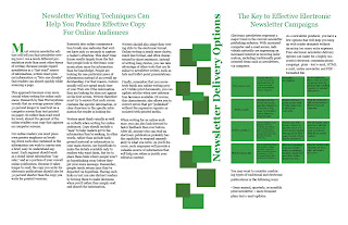
Project 8 - Newsletter Round 2

Our assignment for this week was to re-examine and recreate one of our previous newsletters by building off of the feedback we were given during our midterm evaluation. I chose to redesign my four-page newsletter layout from week 5. This assignment dealt with a large amount of information that had to be constructed in a way that was both visually appealing and easy to read. The initial project required the information to be mixed with images of our choice, within a two-palette color scheme, which would communicate the ideas of the text through our composition.
I developed a design that consisted of a clean, grid like structure, trying to arrange all of the body copy in a way that was easy to read and did not conflict with the imagery or accompanying elements of my piece. I felt that my initial design was successful in this manner, but I had incorporated many elements that were very predictable, especially my ‘straight-to-the-point’ graphics. In redesigning this assignment my main focus was to create a visually stimulating composition that communicated the ideas of the text without using literal images and precise structure (This is a major challenge for me because I am a very structured individual, and basic rules and principles tend to overwhelm my work). My first objective was to read through the copy again and to develop a different approach to communicate a somewhat dry and technical content that dealt with various means of composing and transmitting e-newsletters. In my initial design I fell into the trap of using literal images of computers and keyboards, along with very clean and legible text, which made the content even more boring. For this assignment I came up with the concept of movement – information moving quickly, but with direction. This concept influenced me to clear out all of the copy on my cover page and replace it with an engaging image that conveyed this message through the use of simple shapes and color. I kept my palette from the first attempt, utilizing complementary blues and oranges, which cause a form of visual contrasting movement on the page. This concept was then carried over into my information design on the inner pages. Though not as busy as my cover, I used simple gradations of color inside of simple shapes to further express a feeling of movement (Light shapes becoming darker). By using simple shapes, instead of boring images, I was able to keep the structure of my design neat and clean and was able to visually express meaning without being overly predictable. I am glad we had the chance to approach an assignment in a different manner and hope that I can use this exercise to add a little more thought into my future conceptual designs.